Report are among the standout features of the Money Lover app.
With several adjustments in version 8.0, tracking your income and expenses will become easier and more convenient than ever. Let's dive into the detailed use of this feature.😉
I. Report overview
With the "Global category" function in version 8.0, you can track income and expenses reports across all wallets or individually for each wallet. To do this, follow these steps:
Step 1: Access the Report Overview screen
You can access the Report Overview screen in two ways:
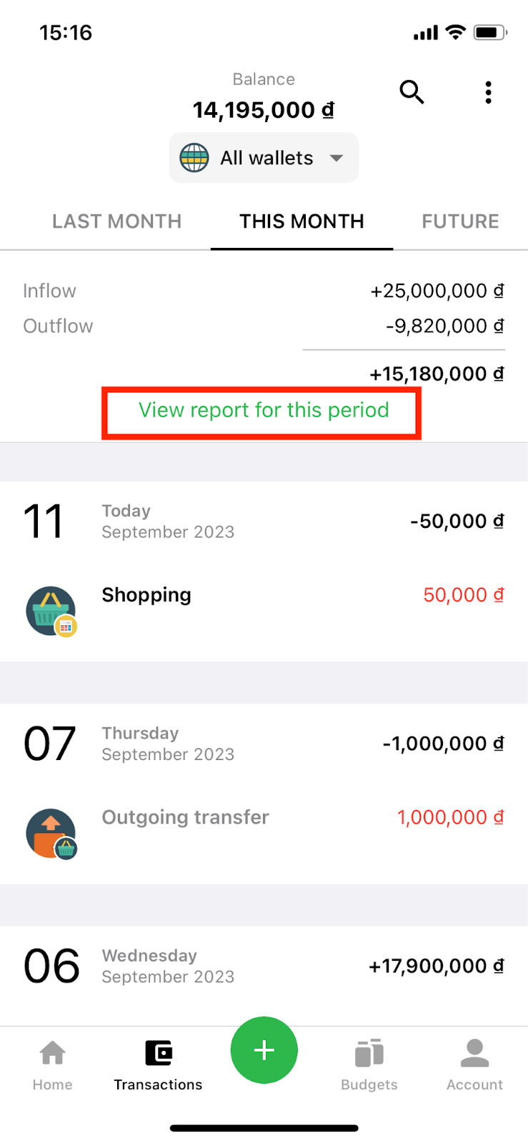
Method 1: From the Transaction screen, select "View reports for this period".
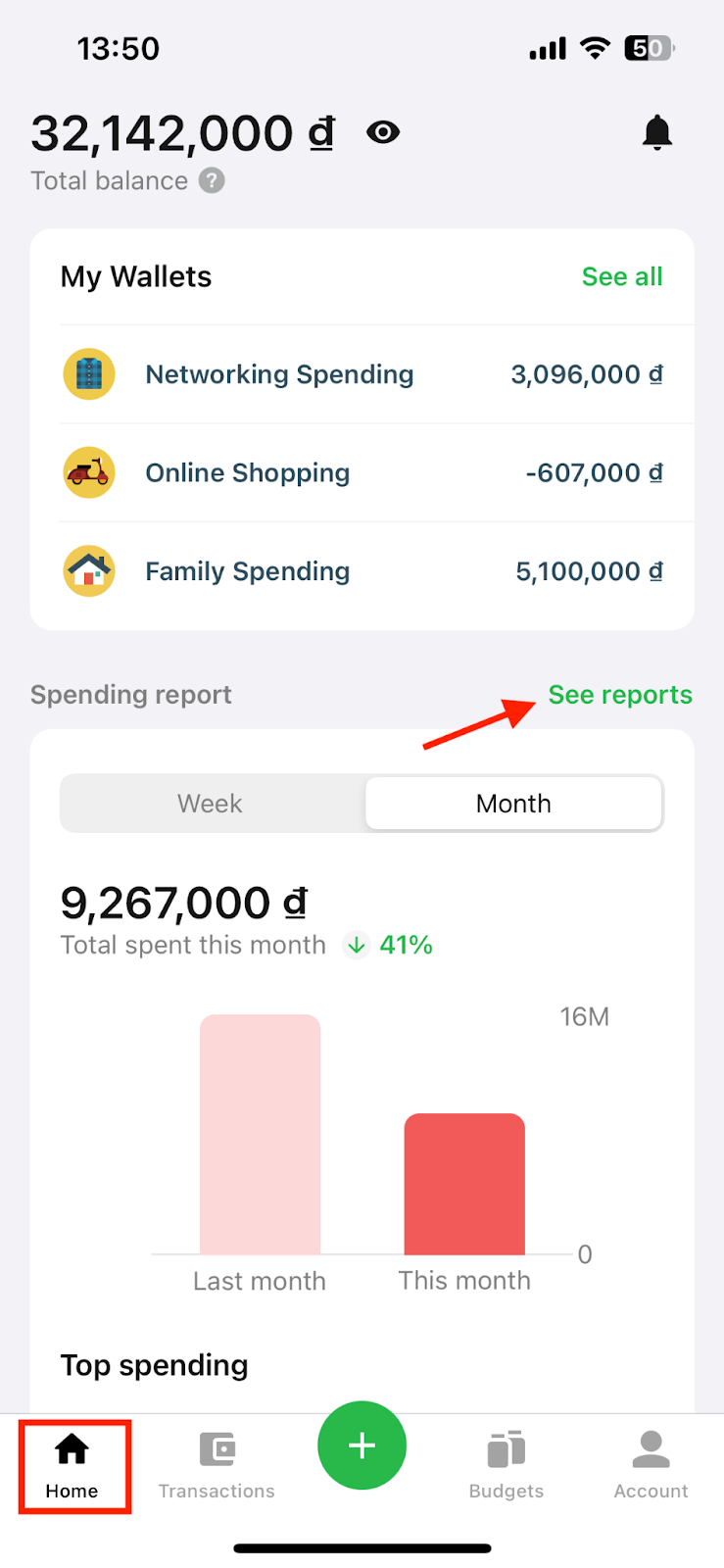
Method 2: From the Home screen, select the "See reports" section.
Step 2: View detailed reports
On the Report Overview screen, you can select the wallet type to view reports via the wallet selection button. You can choose to view income and expense reports for all wallets or for each wallet individually.
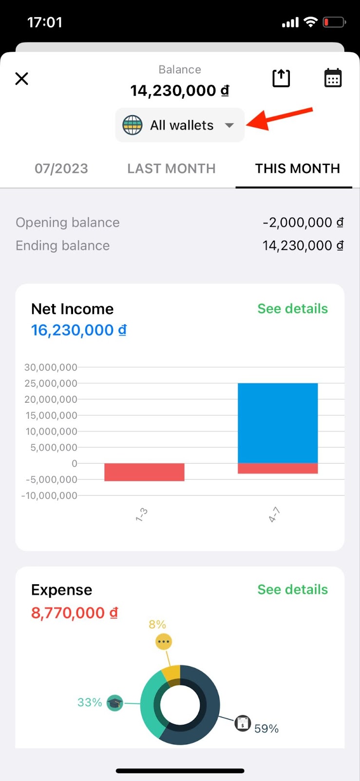
An overview report of "All wallets".
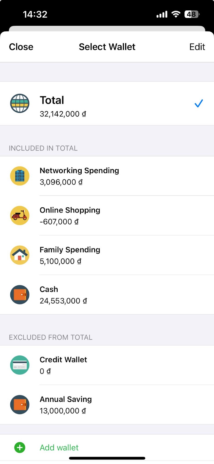
Click on "All wallets" button to select the wallet that you want to see report.
You can also select different time ranges for viewing reports, such as Day, Week, Month, Quarter, Year, or a custom time range according to your preference.
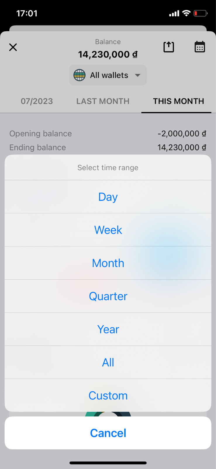
You can change the time range to see report.
Step 3: Monitor the overall reports of wallets for each time range
a) All wallets, basic wallets, linked wallets
On the Report Overview screen, if you choose All wallets, basic wallets, or linked wallets, the app will display wallet information for the selected time range, including:
+) Initial balance: (= Total income - Total expenses) from the beginning to the selected time range.
+) Ending balance: (= Total income - Total expenses) from the beginning to the selected time range.
+) Amount and column chart showing net income.
+) Amount and pie chart showing Expenses, Incomes.
+) Debt amount.
+) Borrowed amount.
+) Other amount: the total amount of transactions not included in the report.
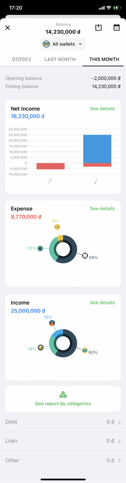
Full report screen.
b) Goal wallets
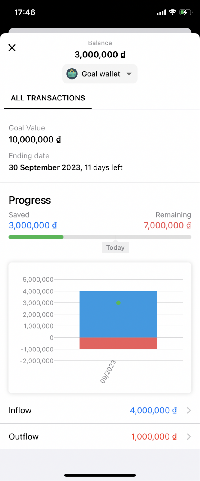
On the Report Overview screen, if you choose a goal wallet (changed in the "all wallets" button), the app will display the following information for the selected time range:
+) Goal value.
+) End date of savings.
+) Saved: Amount saved up to now.
+) Remaining: Amount needed to reach the goal.
+) Status bar showing the percentage of the amount saved compared to the goal.
+) Chart showing income and expenses of the savings wallet.
+) Inflow: Total money received in the savings wallet.
+) Outflow: Total money spent in the savings wallet.
c) Credit Wallets
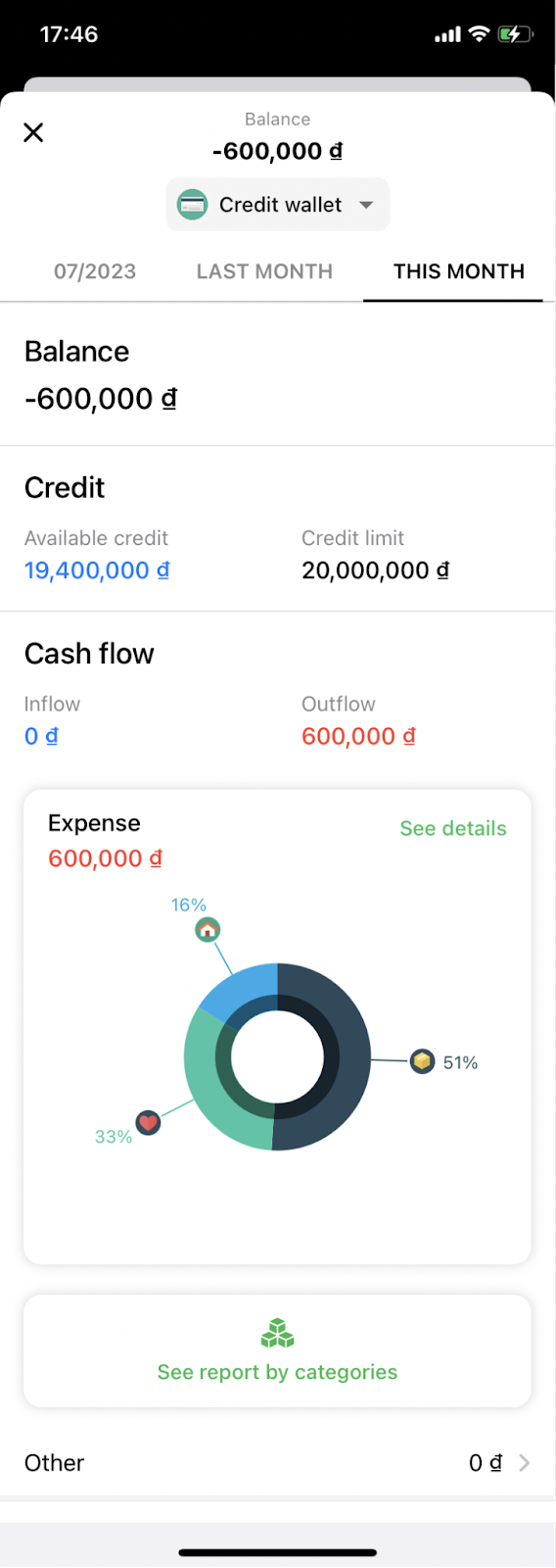
Similarly, if you choose a credit wallet, the app will display the following information for the selected time range:
+) Credit balance.
+) Available credit.
+) Credit limit.
+) Cash inflow, cash outflow of the credit wallet.
+) Expense: Amount spent from the credit wallet.
+) Pie chart showing the expenditure ratio of various groups in the credit wallet.
+) Other amount: the total amount of transactions not included in the report.
II. Net Income
"Net income" is the amount of income transactions (included in the report) minus the amount you spent (included in the report) for the selected time period.
Step 1: Access the detailed net income screen
From the Report Overview screen, you can view detailed net income by selecting the "See details" button in the net income area, as shown in the image below.
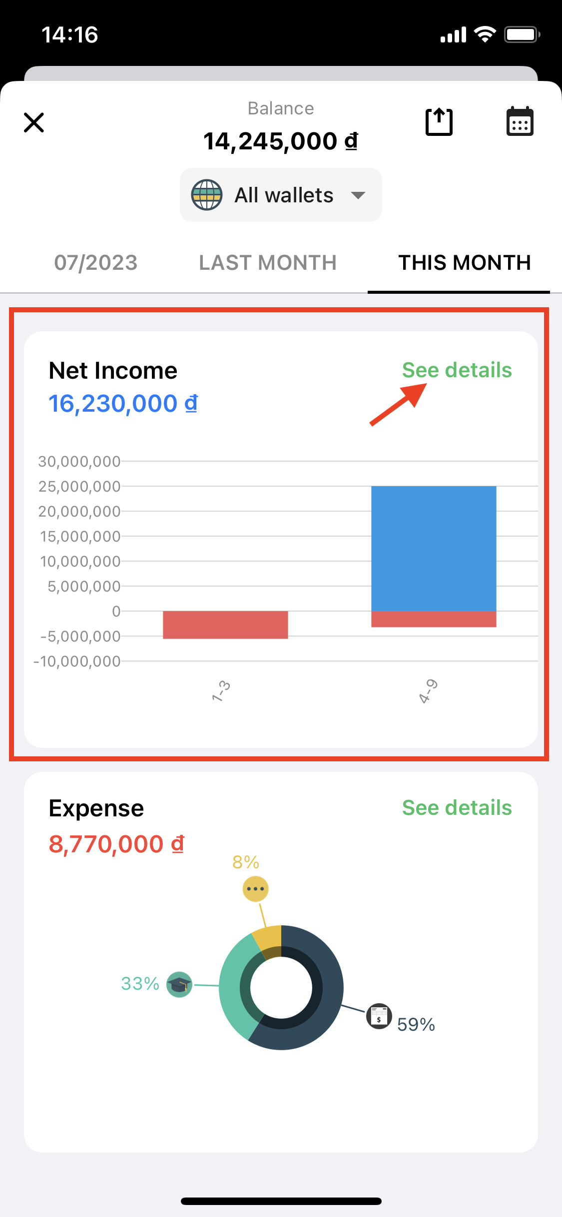
At this point, the app will display the detailed net income screen for the wallet and time range selected in the Overview screen.
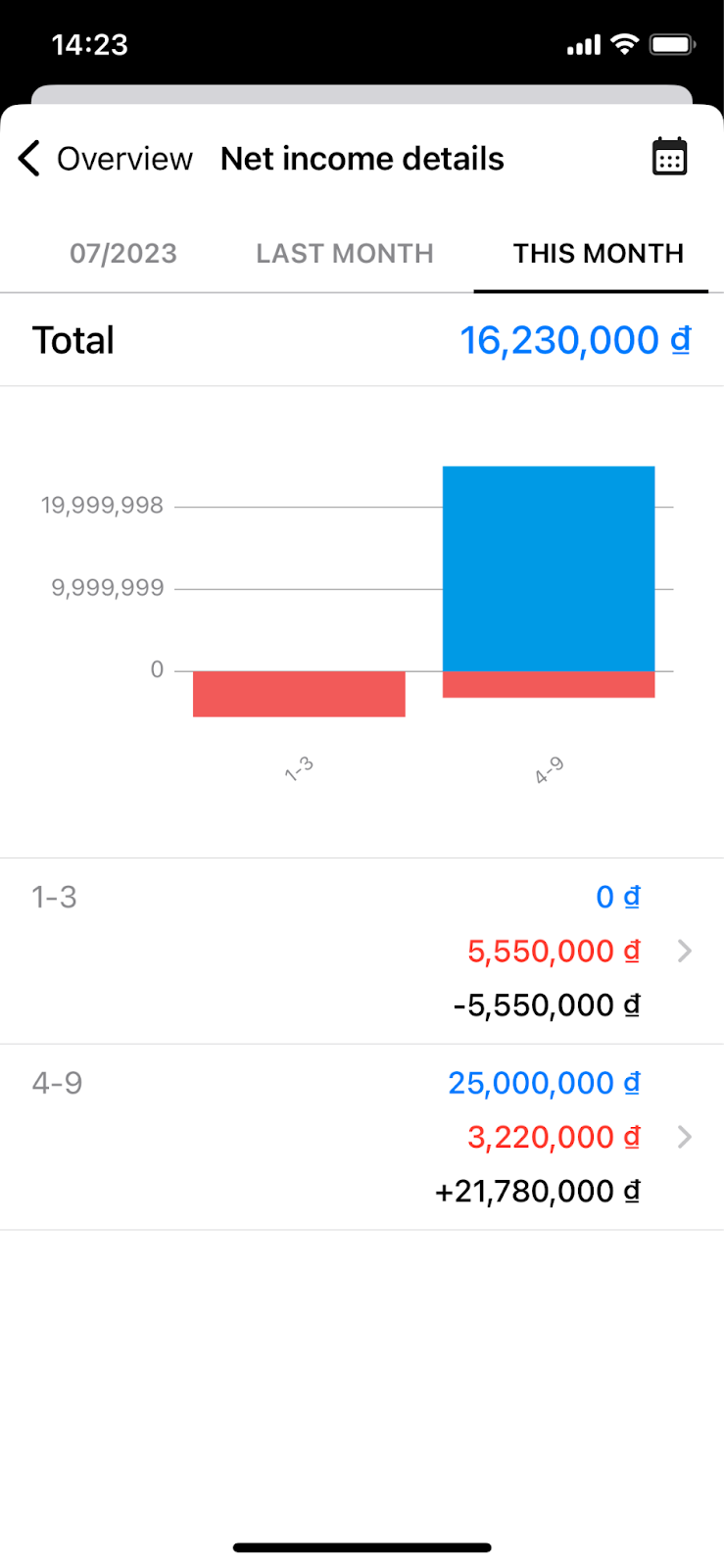
On the detailed net income screen, you can track:
+) The total net income for the selected time range. A chart showing the amount of income and expenses included in the report for each smaller time interval.
+) Details of the income and expense amounts included in the report for each smaller time interval.
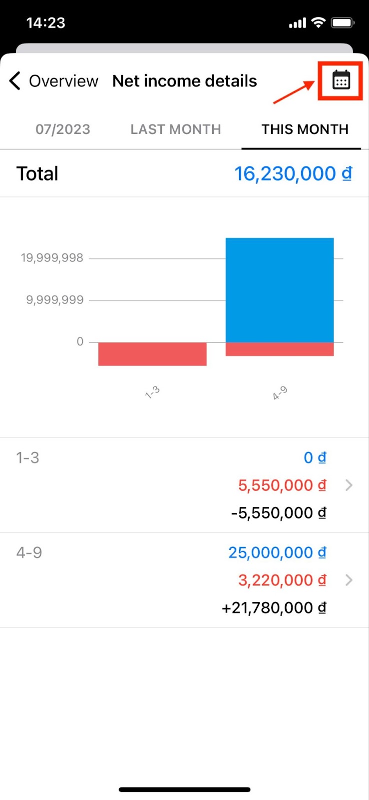
Step 2: Change the reporting period for net income
To change the reporting period for detailed net income reports (Day, Week, Month, Quarter, Year, etc.), you can click on the Calendar icon in the top right corner of the screen.
Step 3: View detailed income and expense transactions included in the report for each time interval
You can also view detailed income and expense transactions included in the report for each smaller time interval by clicking on that time interval. The app will display a list of income and expense transactions for the selected time period.
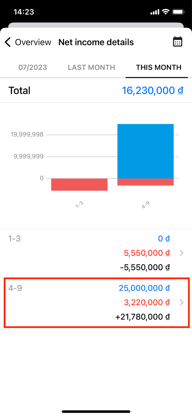
Example of income and expenditure by period from the 4th to the 9th of this month. Click to see more details (as shown below).
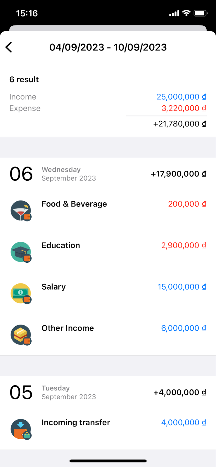
Details of income and expenditure transactions included in the report during the period from the 4th to the 9th of the month.
III. Expense Details
Step 1: Access the detailed expense screen
From the Report Overview screen, you can view detailed expense information by selecting the "See details" button in the expense area.
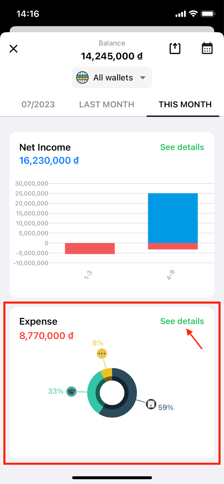
On the detailed expense screen, you can choose to display the report in either a pie chart or a bar chart. You can also change the reporting time range (as below).
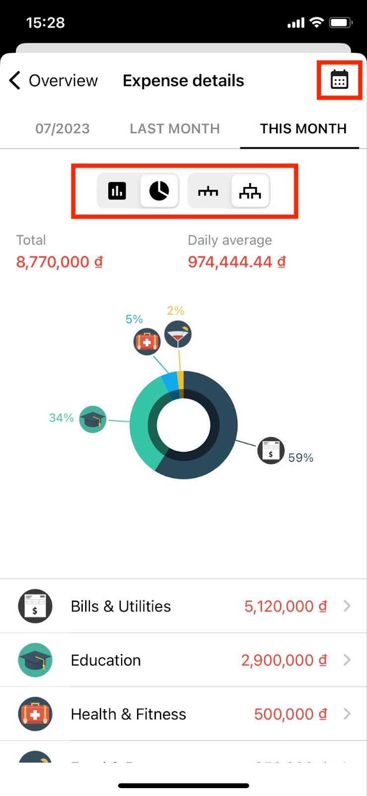
Step 2: Monitor detailed expense reports in pie chart
When viewing detailed expense reports in pie chart, you have two options:
2.1. View the report with subcategories grouped under parent categories: In this case, the app will display the amount and percentage of expenses for each parent category compared to the total expenses for the selected time period.
2.2. View the report without grouping subcategories under parent categories: In this case, the app will not differentiate between parent and subcategories and will display all categories equally. The report will show the amount and percentage of expenses for each category compared to the total expenses for the selected time period.
You need to select the icon to group the child group into the parent group or not, to be able to view the report.
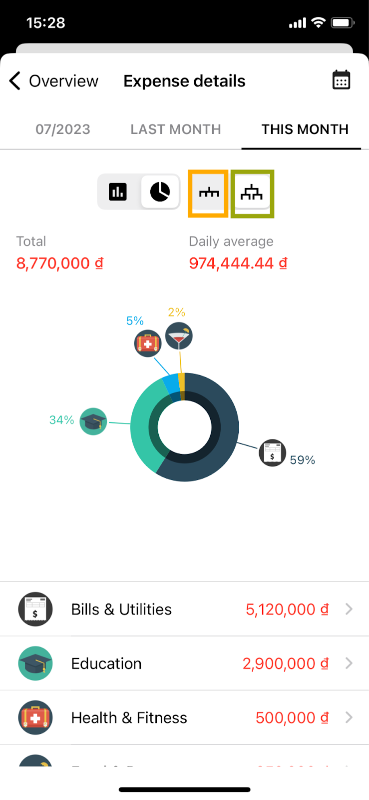
Icon of all peer groups (orange) and parent-child group division (green).
When selecting to view reports in the form of pie charts, you will have the following information:
+) Total: This is the total amount of expenses included in the report for the selected time period.
+) Daily average: This is the average amount you've spent per day.
+) Pie chart: This chart shows the percentage of expenses for each category compared to the total expenses for the selected time period.
+) Amount spent for Each Category in the Selected Time Period.
Next, you can view detailed reports for each category by selecting the category on the expense details screen.
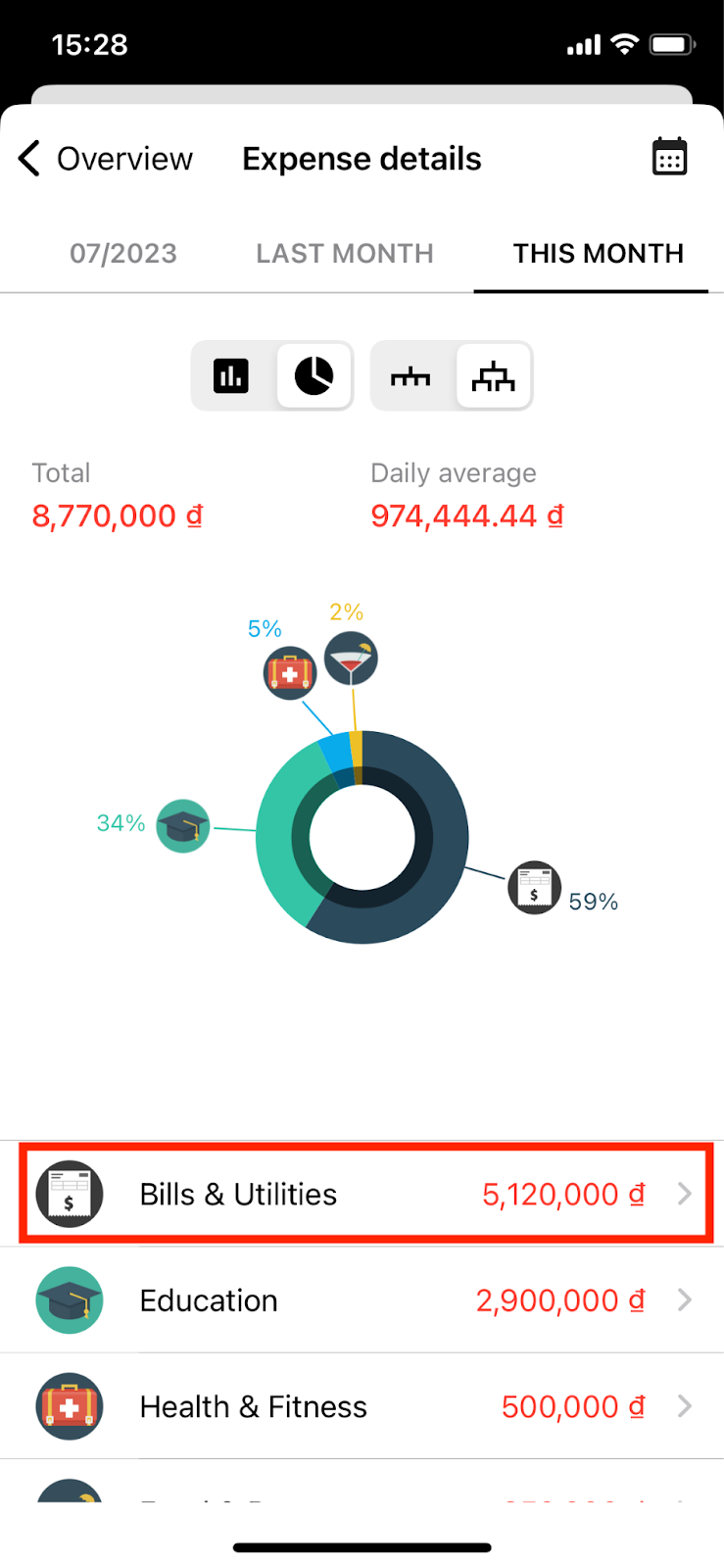
Click on the category you want to see detailed reports.
At the category report screen, you can view reports in two formats: Bar Chart or Pie Chart.
If you choose to view a pie chart (note that a pie chart can only be viewed when the category being reported on contains subcategories with transaction expenses), you will have the following information:
+) Total: This is the total amount spent for the category within the selected time period.
+) Average Daily: This is the average amount spent on that category per day.
+) Pie Chart: This chart shows the percentage of expenses for subcategories compared to the total expenses for the parent category within the selected time period.
+) Expense Amount for Each Subcategory.
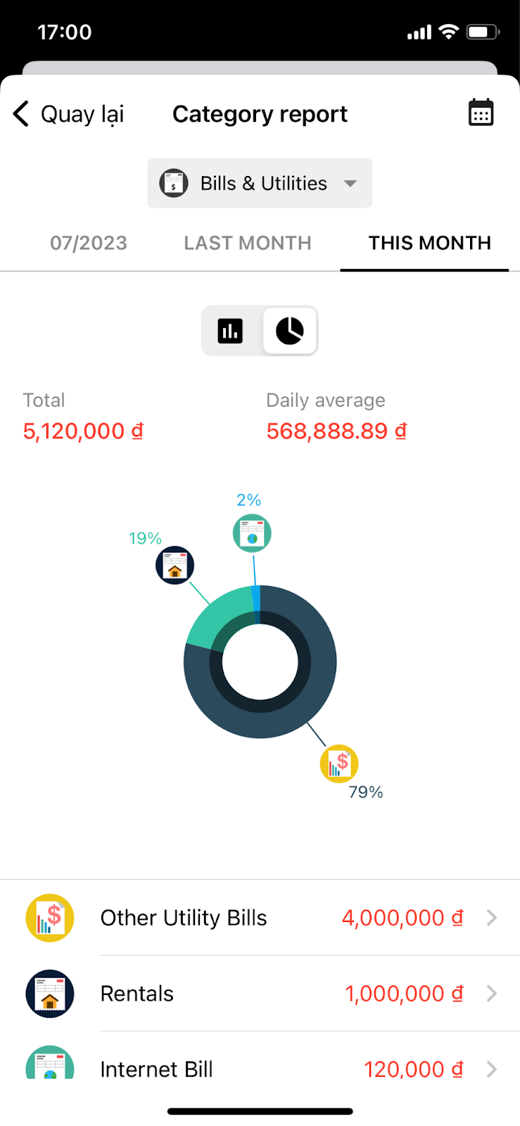
Report screen by category in the form of a pie chart.
Similarly, the bar chart also provides the following information:
+) Total: This is the total amount spent for the category within the selected time period (e.g., last month, this month, etc.).
+) Average Daily: This is the actual average amount spent on that category per day.
+) Bar Chart: This chart displays the spending level for the category in smaller time intervals, such as from the 1st to the 3rd day of that month.
+) Spending Level of the Category within the Time Intervals, similar to the bar chart above (You can view the details of expenses by selecting the time period).
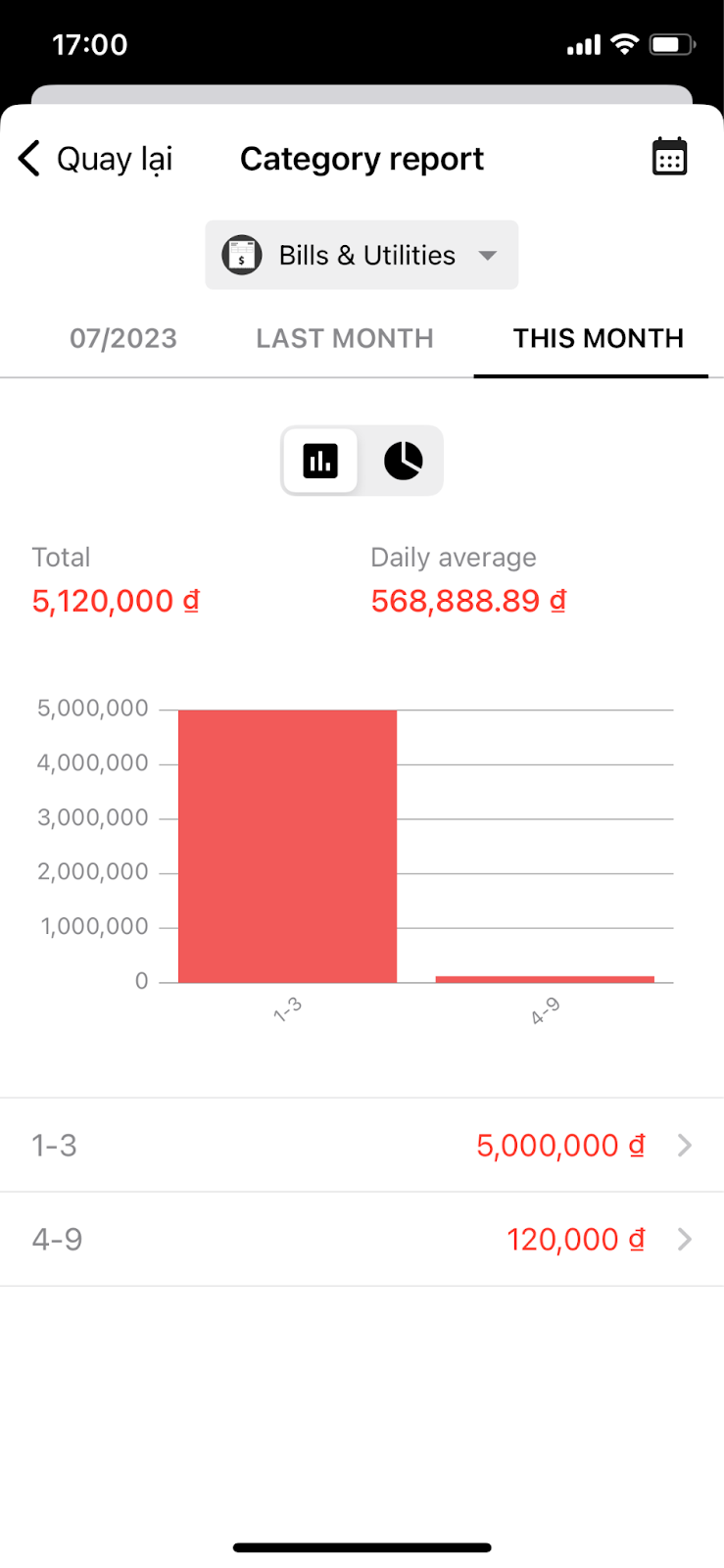
Report screen by category viewed in bar chart.
Step 3: Tracking Expense Reports shown in Bar Chart
On the Expense Details screen, select the bar chart icon to view expense reports in bar chart format. You can also change the report's time periods by selecting the calendar icon.
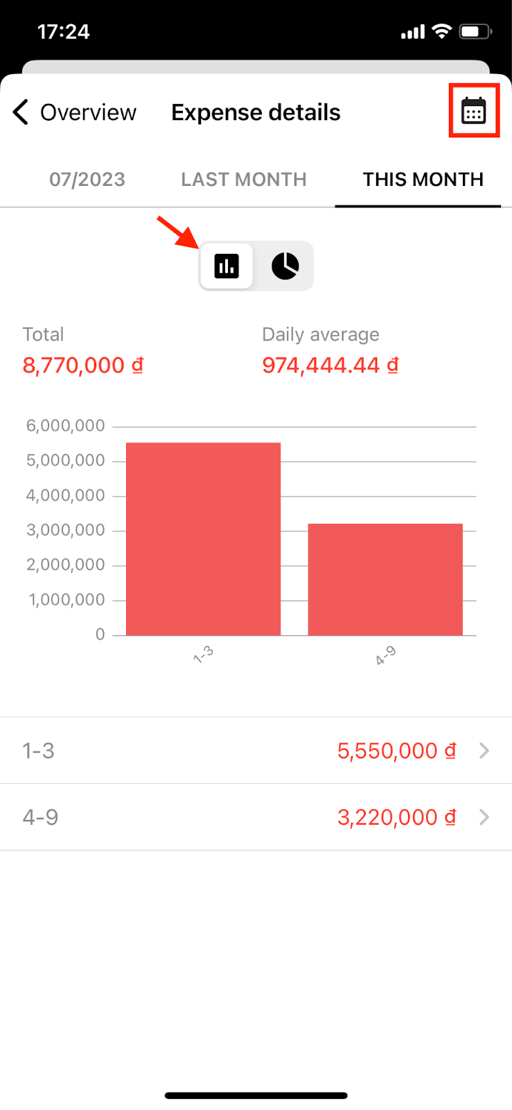
Select the column chart icon to track expense details.
To view detailed expenses for a specific time period, select that time period. The app will display a list of expense transactions for the selected time frame.
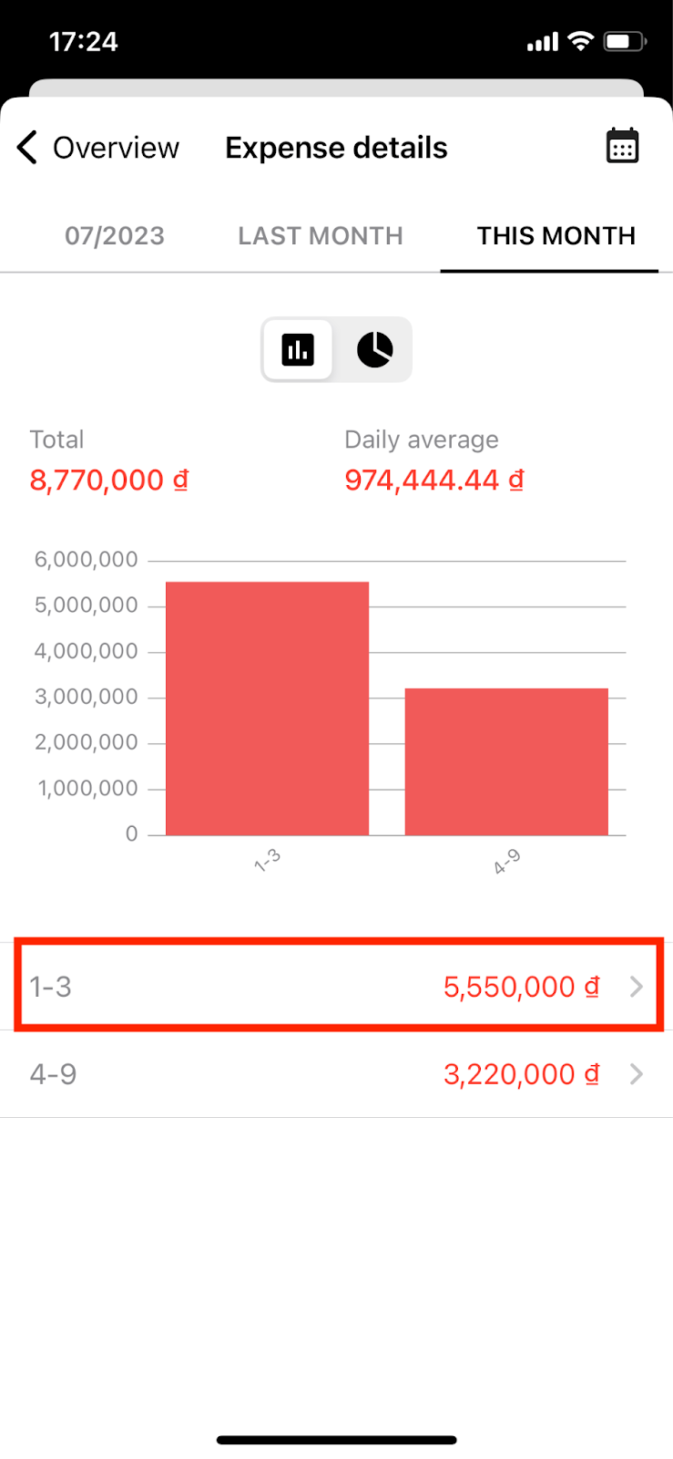
Select a time period to view a list of specific expense transactions.
Now, the app will display a list of expense transactions for the selected time frame.
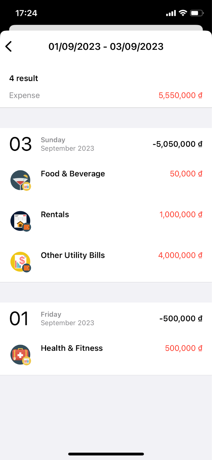
List of expenses for the period selected above, for example September 1-3.
IV. Income details
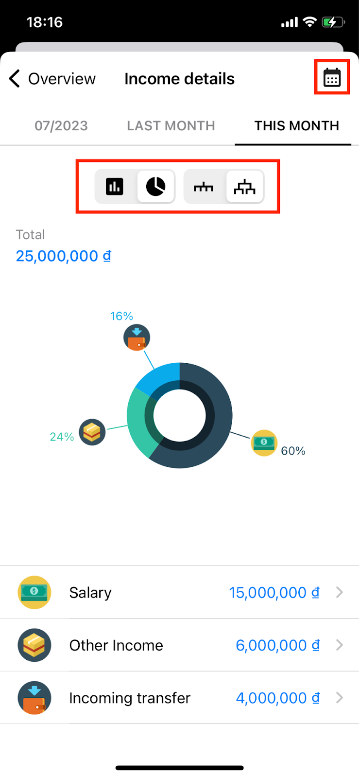
Step 1: Access the Income Details Screen
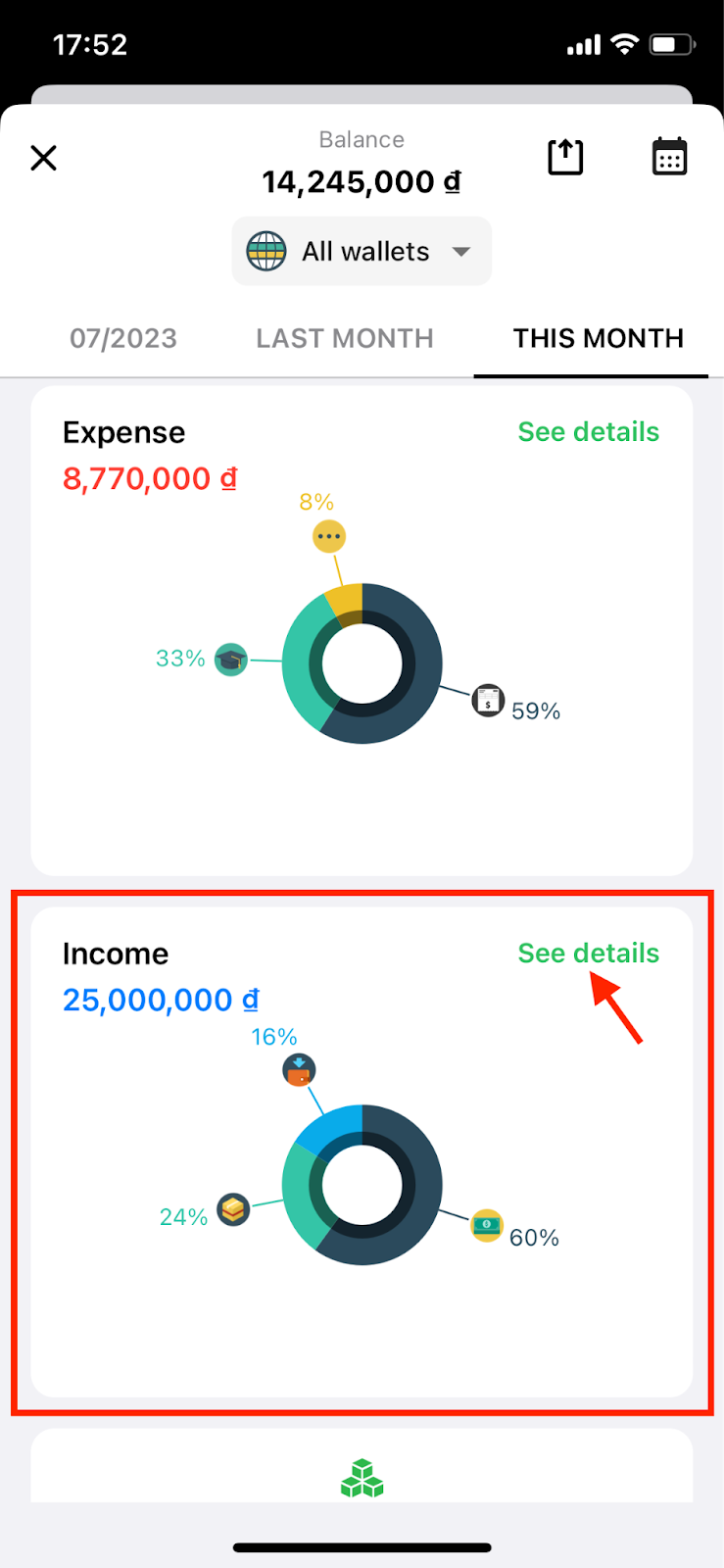
From the Overview Report screen, you can access detailed income information by clicking the "See Details" in the income section.
On the Income Details screen, you can choose to display reports in pie chart or bar chart format and change the report's time periods.
Step 2: Track Detailed Income Reports in Pie Chart Format
When tracking detailed income reports in pie chart format, you have two options:
2.1. Viewing reports when grouping subcategories into parent categories: In this case, the app will display the amount and percentage of income for each parent category compared to the total income for the selected report time period.
2.2. Viewing reports without grouping subcategories into parent categories: In this case, all categories are equal (no longer parent-child relationships). The report will display the amount and percentage of income for all categories compared to the total income for the selected report time period.
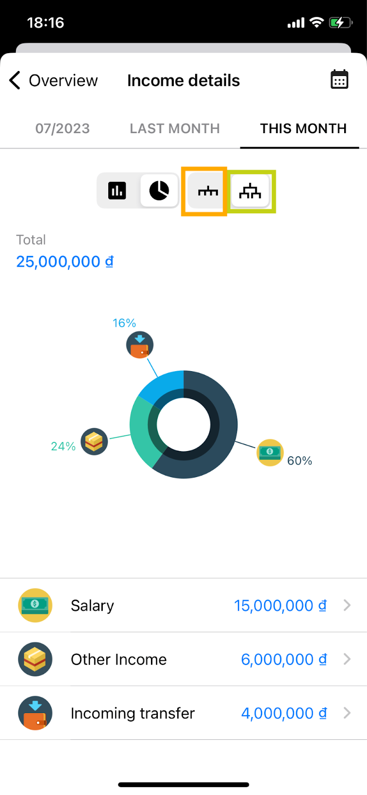
You need to select the ungroup icon (orange) or view by parent-child group (green) to be able to view the report.
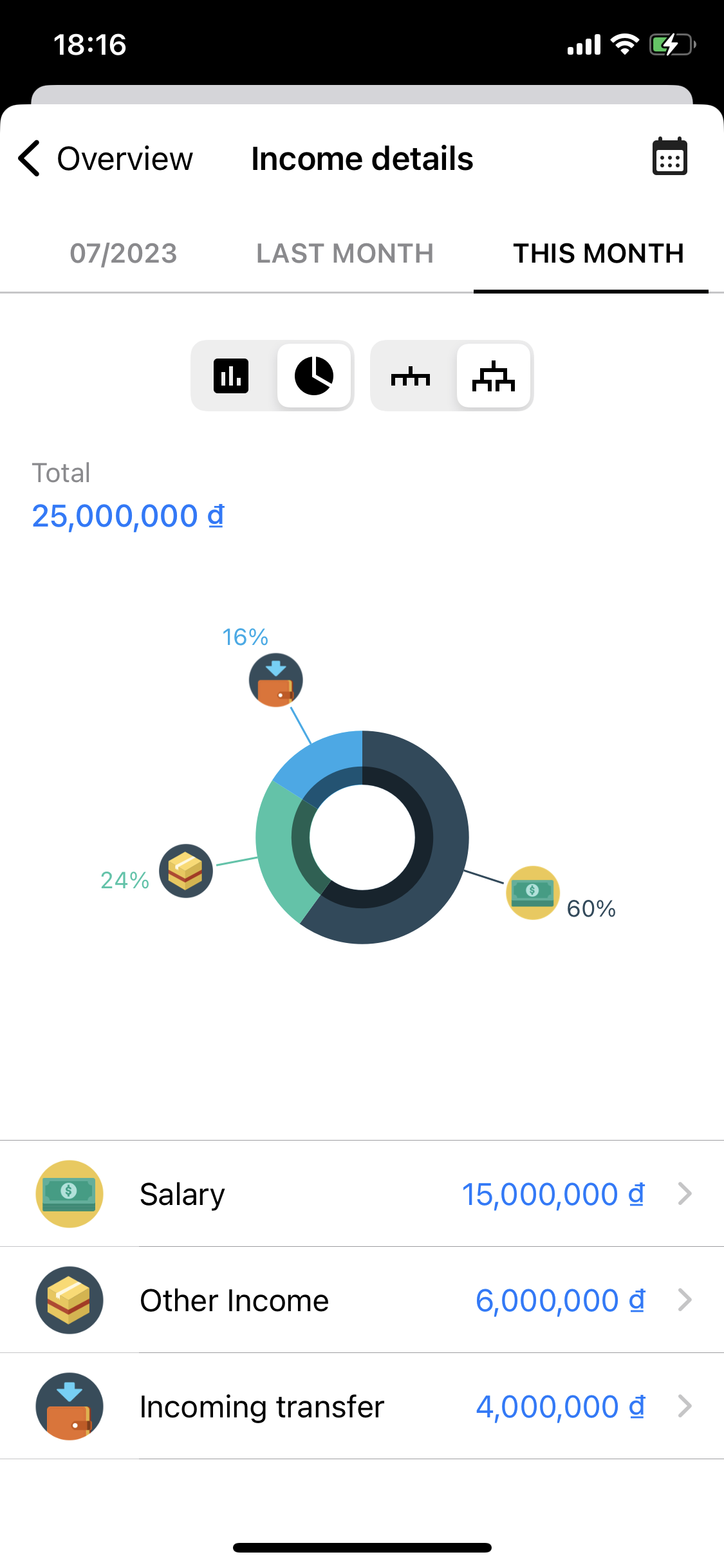
When you view detailed income reports in pie chart format, you can track information about your income within the selected time period, including:
+) Total: This is the total amount of income included in the report for the chosen time period.
+) Pie Chart: It represents the percentage of income from different categories compared to the total income for the selected time period.
+) Income Amount for Each Category within the Selected Time Period.
Next, you can view detailed reports for each income category by selecting the category on the income details screen.
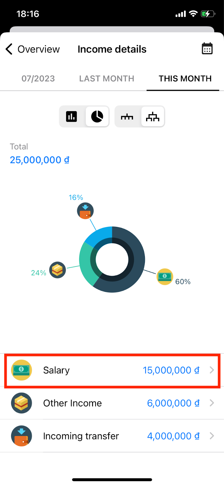
Click to select the group you want to view the report.
On the income details screen, you can choose to display reports in either bar chart or pie chart format:
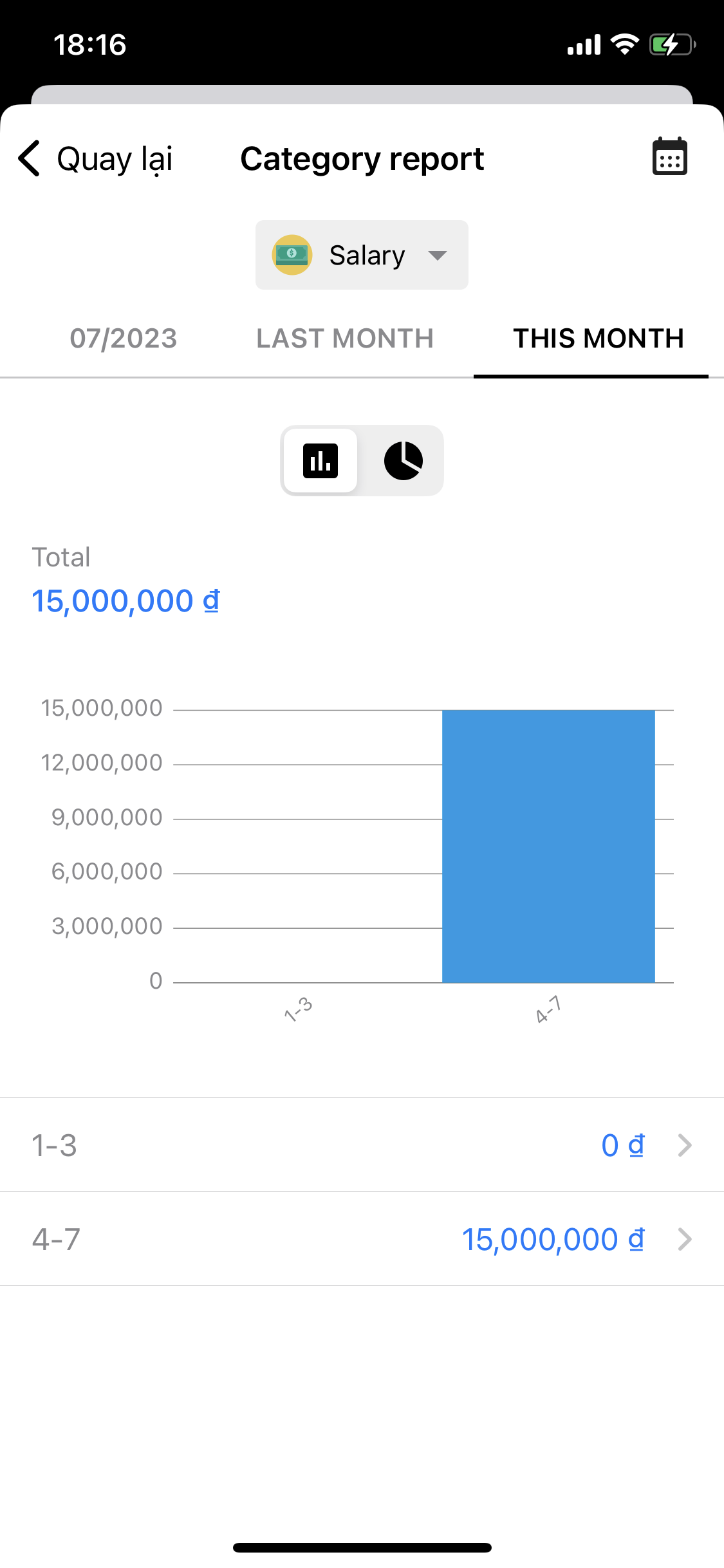
If you choose to view them as bar charts, you can track the following information for each category:
+) Total: This is the total income for the category within the selected time period, for example, this month.
+) Bar chart: It shows the income level for the category within smaller time intervals, like from the 1st to the 3rd day of the month.
+) Income level of the Categories within Time Intervals, similar to the bar chart above (You can view the details of income for the category within specific time intervals by selecting that interval).
Report by category viewed in bar chart.
If you choose to view them as pie charts (please note that pie charts can only be viewed when the category being reported on contains subcategories with income transactions), you will have the following information:
+) Total: This is the total income for the category within the selected time period.
+) Pie Chart: It displays the percentage of income for subcategories compared to the total income for the parent category within the selected time period.
+) Income Amount for Each Subcategory.
The category report screen is viewed in pie chart.
Step 3: Track Detailed Income Reports in Bar Chart
On the Income Details screen, select the bar chart icon to view income reports in bar chart format. You can also change the report's time periods by selecting the calendar icon (in the upper right corner).
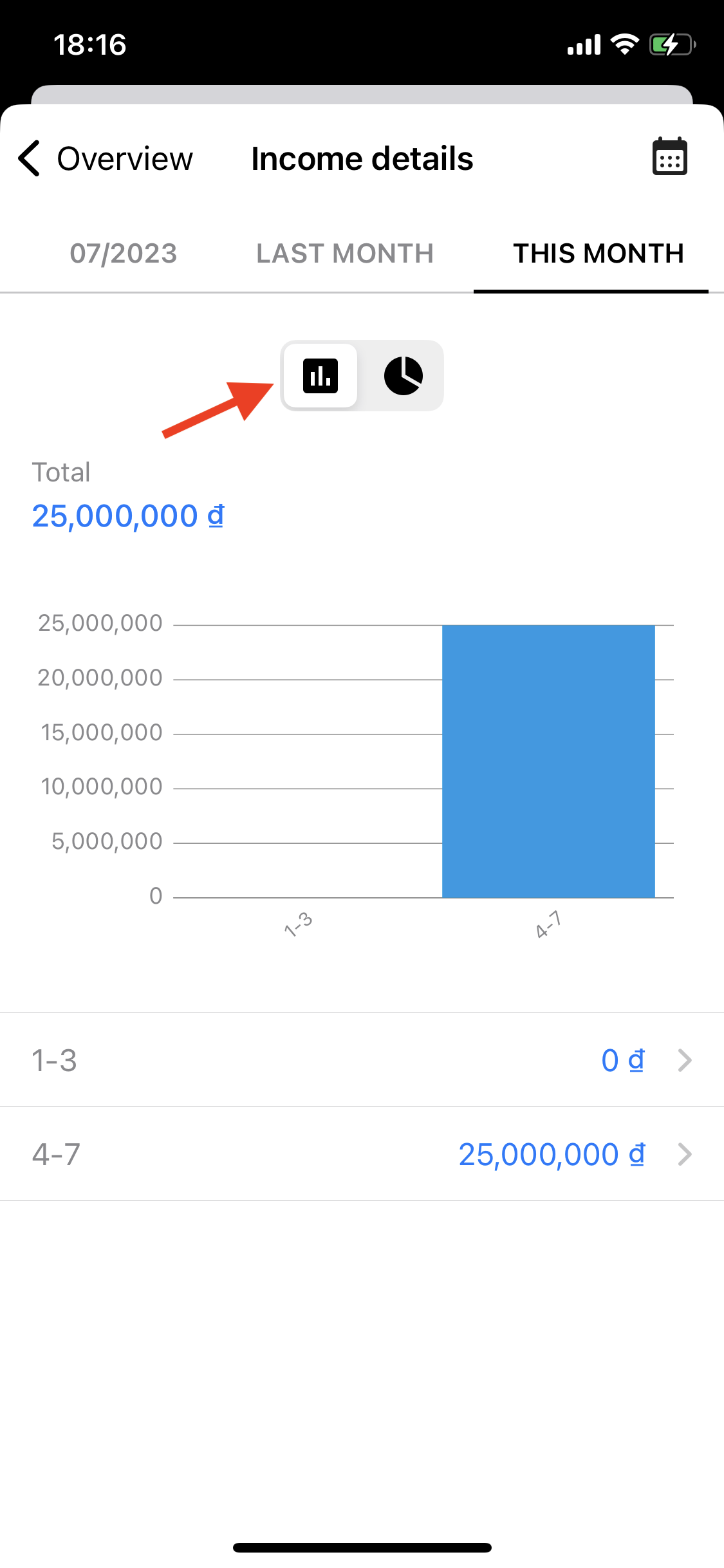
Select the column chart icon to track revenue details in bar chart format.
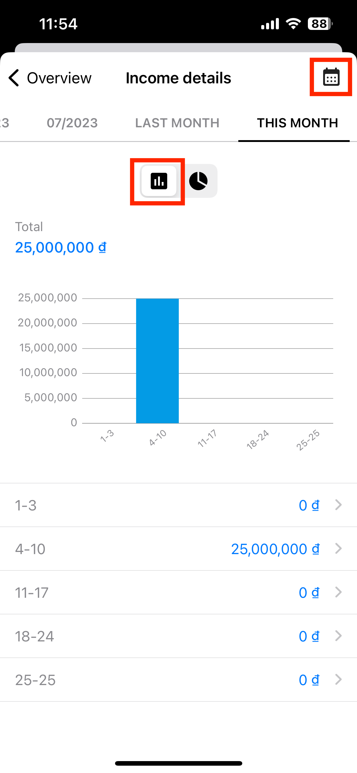
When viewing in bar chart format, you can track the following information for each category:
+) Total: This is the total income for the category within the selected time period.
+) Bar Chart: This chart displays the income level for the category in smaller time intervals.
+) Income Level of the Categories within the Time Intervals, similar to the bar chart above (You can view the details of income by selecting the time period).
To view detailed income transactions within a specific time period, select that time period. The app will display a list of income transactions for the selected time frame.
Select a period in the column chart to see a list of income transactions.
Now, the app will display a list of income transactions for the selected time frame.
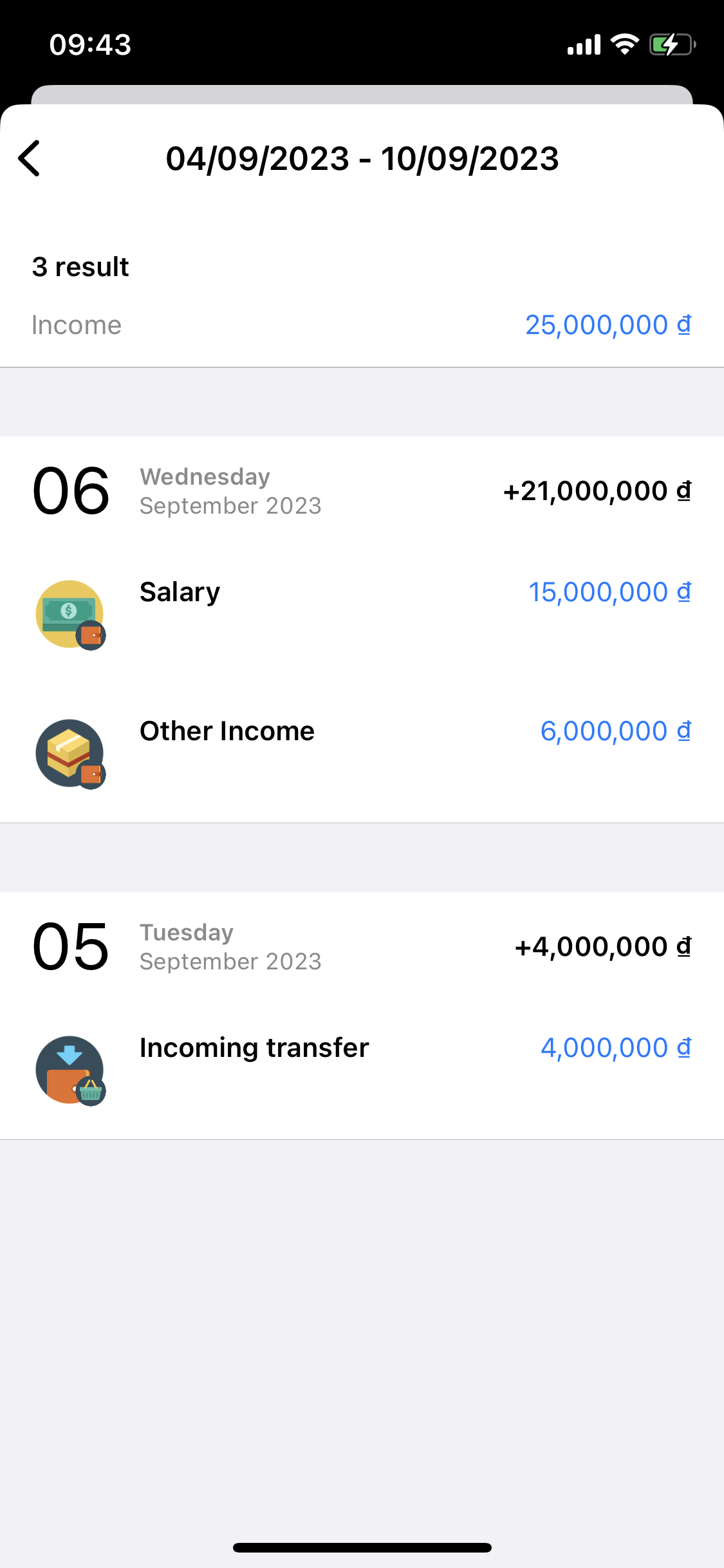
List of transactions recorded during the selected period.
V. Categories report
In version 8.0 with Global category, you can easily view group reports directly on the Overview Report screen.
Step 1: Access the Categories Report Screen
On the Overview Report screen, you can view categories report by selecting the "See report by categories" button.
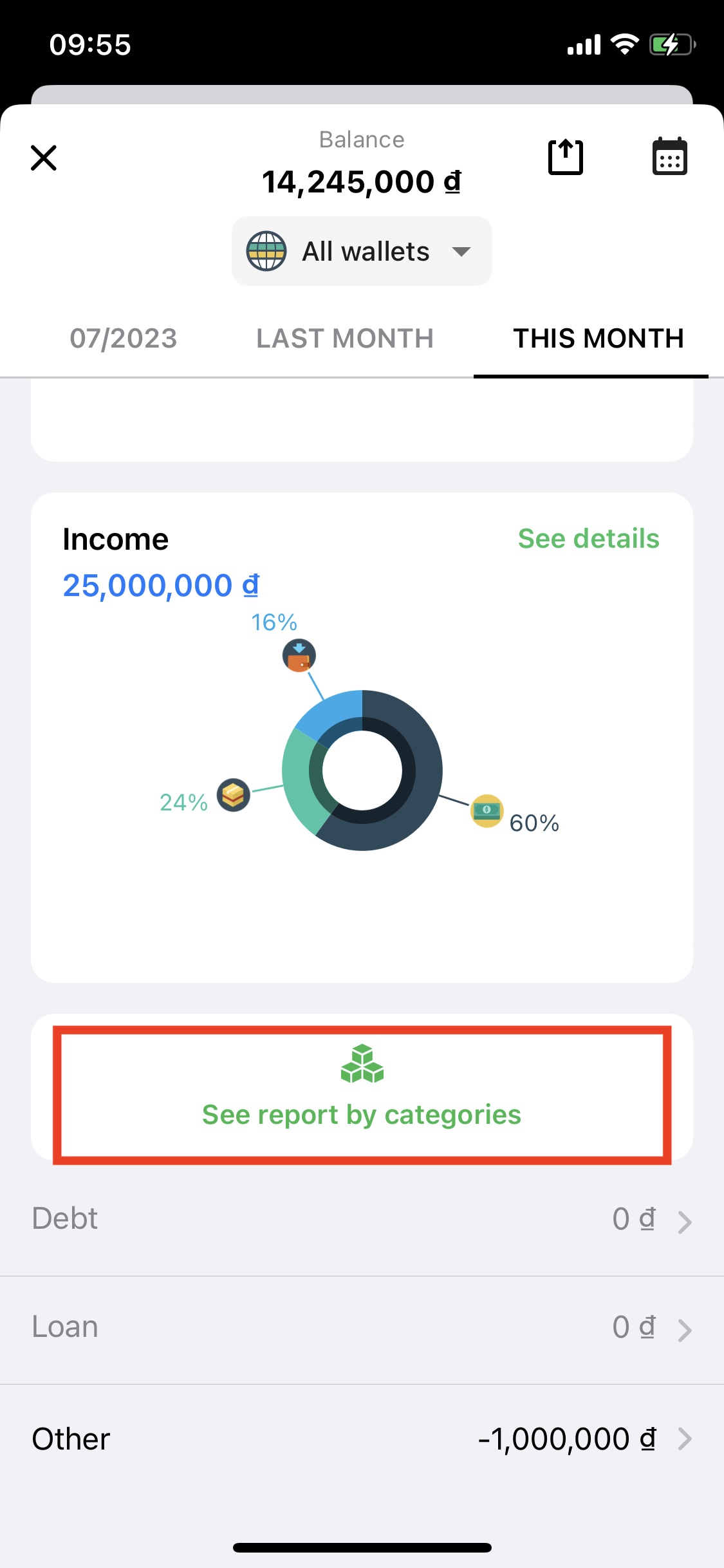
Here, the app will display the Category Report screen (when the category has not been selected).
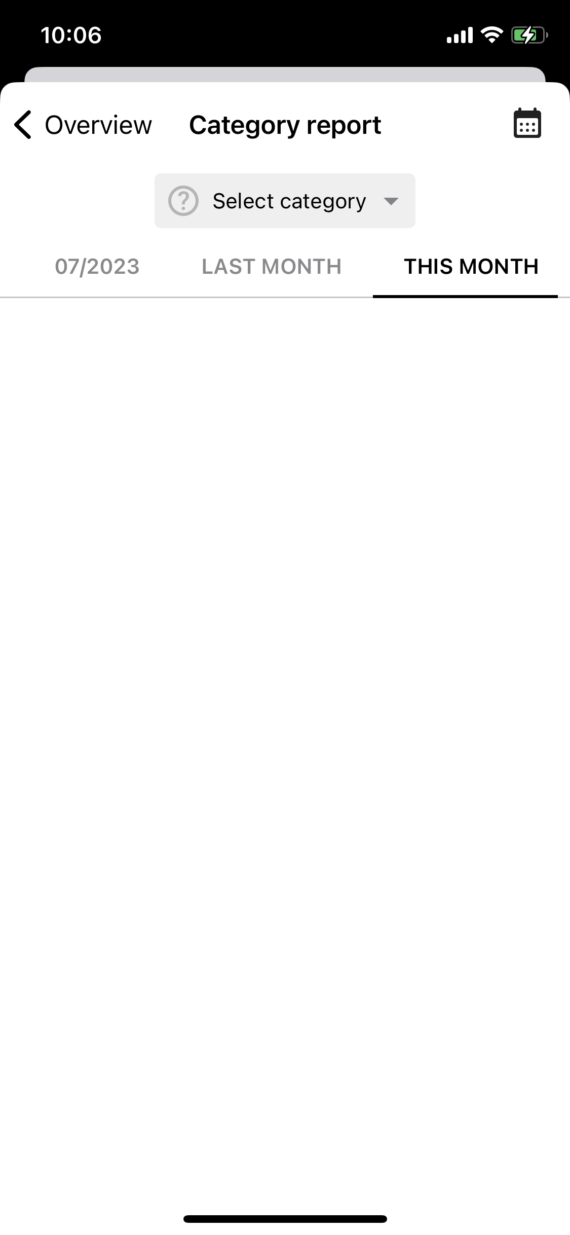
Report screen by category (when category is not selected).
Step 2: Select the Group You Want to View Reports for
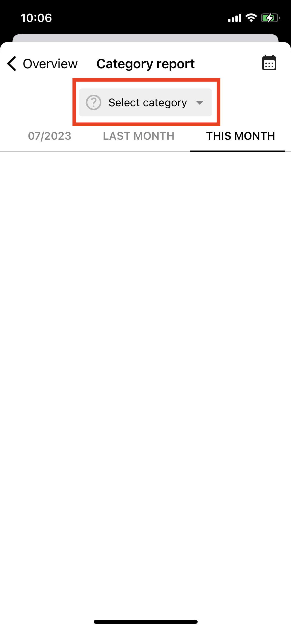
On the category report screen, you can choose which category you want to view reports for by selecting the "Select category" button.
At the Select Group screen, you can choose the Income or Expense tab, and then select the group you want to view reports for.
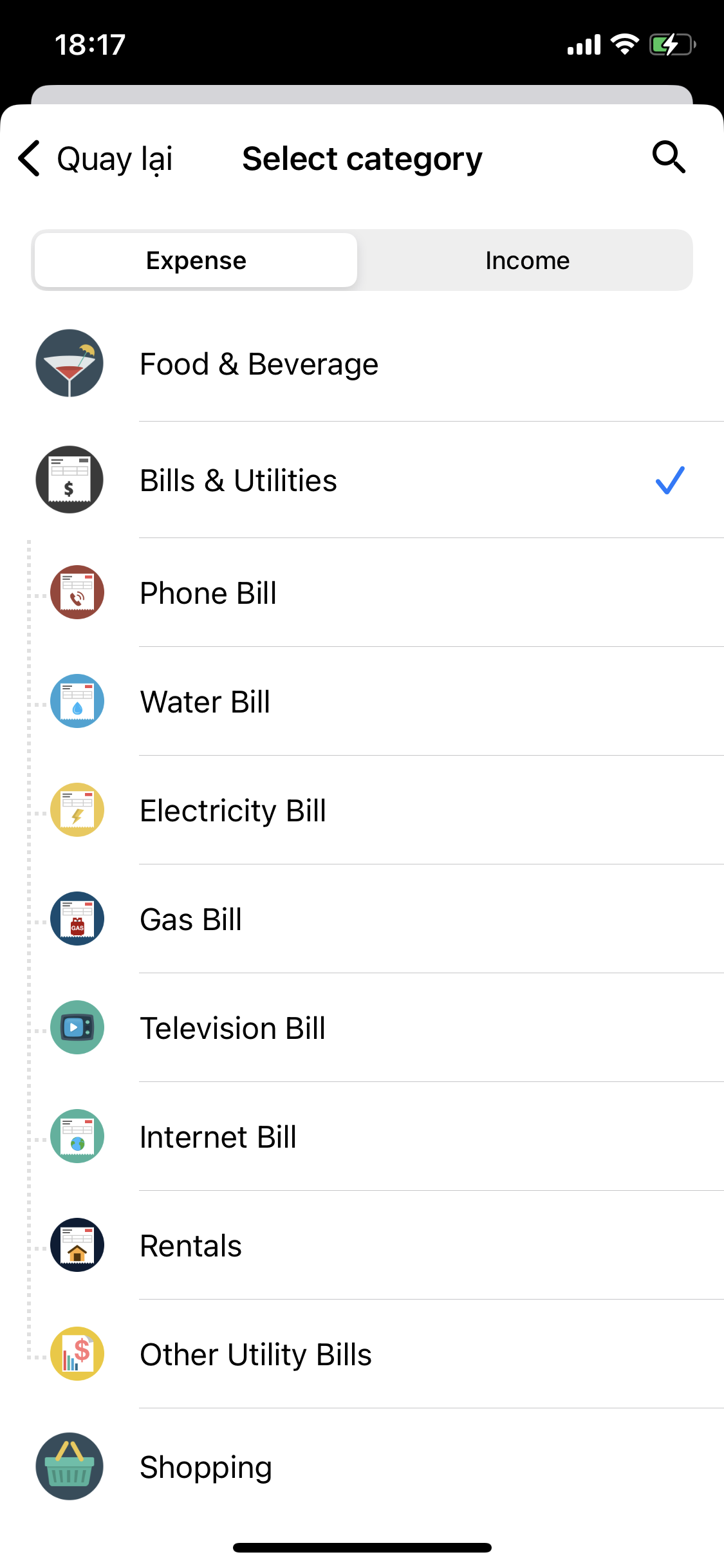
Select the category you want to view the report on the "Select category" screen.
Step 3: View the Reports
When viewing group reports, you can choose to view reports for subcategories or parent categories.
If you choose to view reports for subcategories, the app will display reports in the form of bar charts for the selected subcategory.
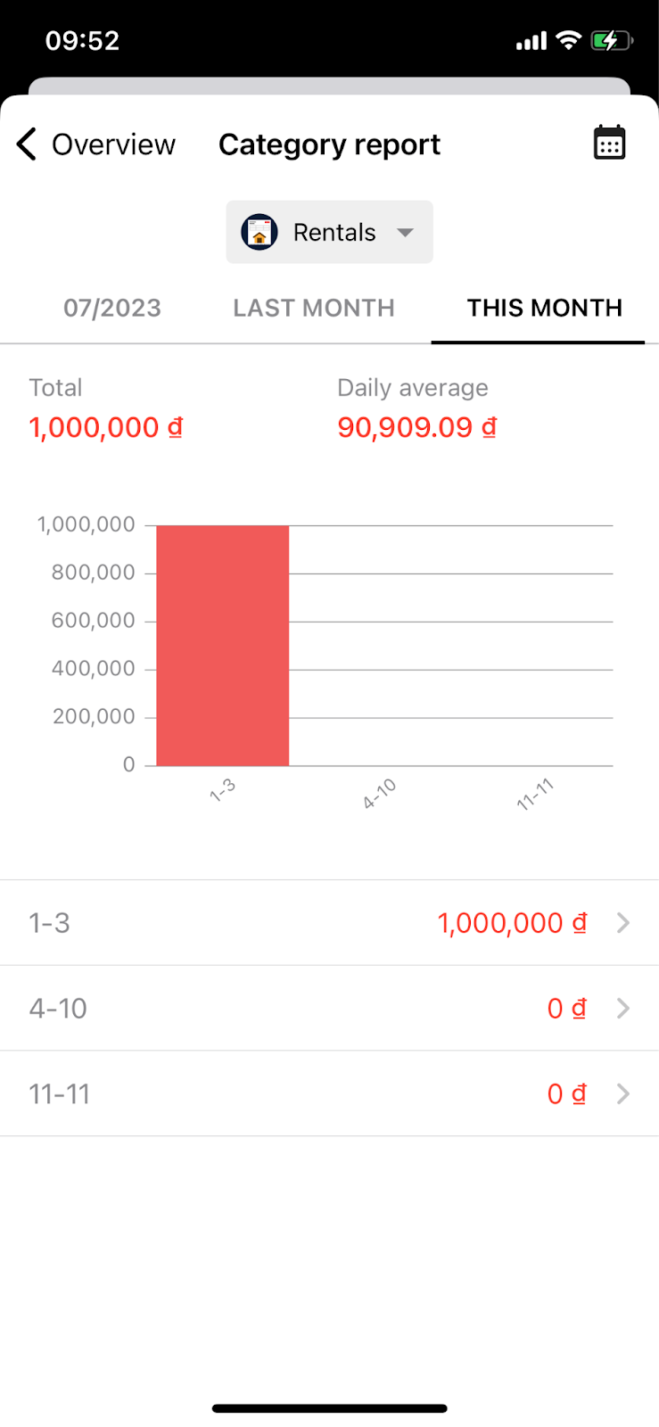
Rental report (a subcategory of Bills & Utilities category).
If you choose to view reports for the parent category, you can view reports in either bar chart or pie chart, as explained above.
If you choose to view them as bar charts, you can track the following information for each category:
+) Total: This is the total spending for the category within the selected time period, for example, this month.
+) Bar Chart: It shows the spending level for the category within smaller time intervals, like from the 1st to the 3rd day of the month.
+) Expense Level of the Categories within Time Intervals, similar to the bar chart above (You can view the details of expense for the category within specific time intervals by selecting that interval).
You can also adjust the time periods for the reports and select different time intervals using the calendar icon.
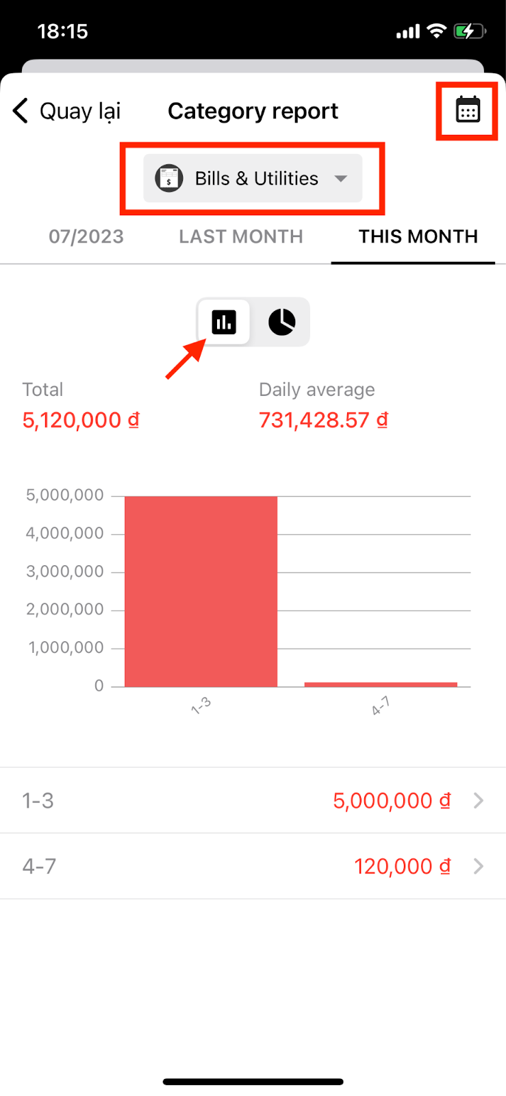
Report parent category (Bills & Utilities) in column chart format.
If you choose to view them as pie charts, you will have the following information:
+) Total: It is the total amount of money received/spent for the group within the selected time period.
+) Daily Average: It is the average amount of money spent on that group every day (only available in the expenditure group report).
+) Pie Chart: It shows the percentage of income/expenditure of the groups compared to the total income/expenditure within the selected time period.
+) Amount of Income/Expenditure for Each Subgroup.
You can also change the report's time period by selecting the Calendar icon.
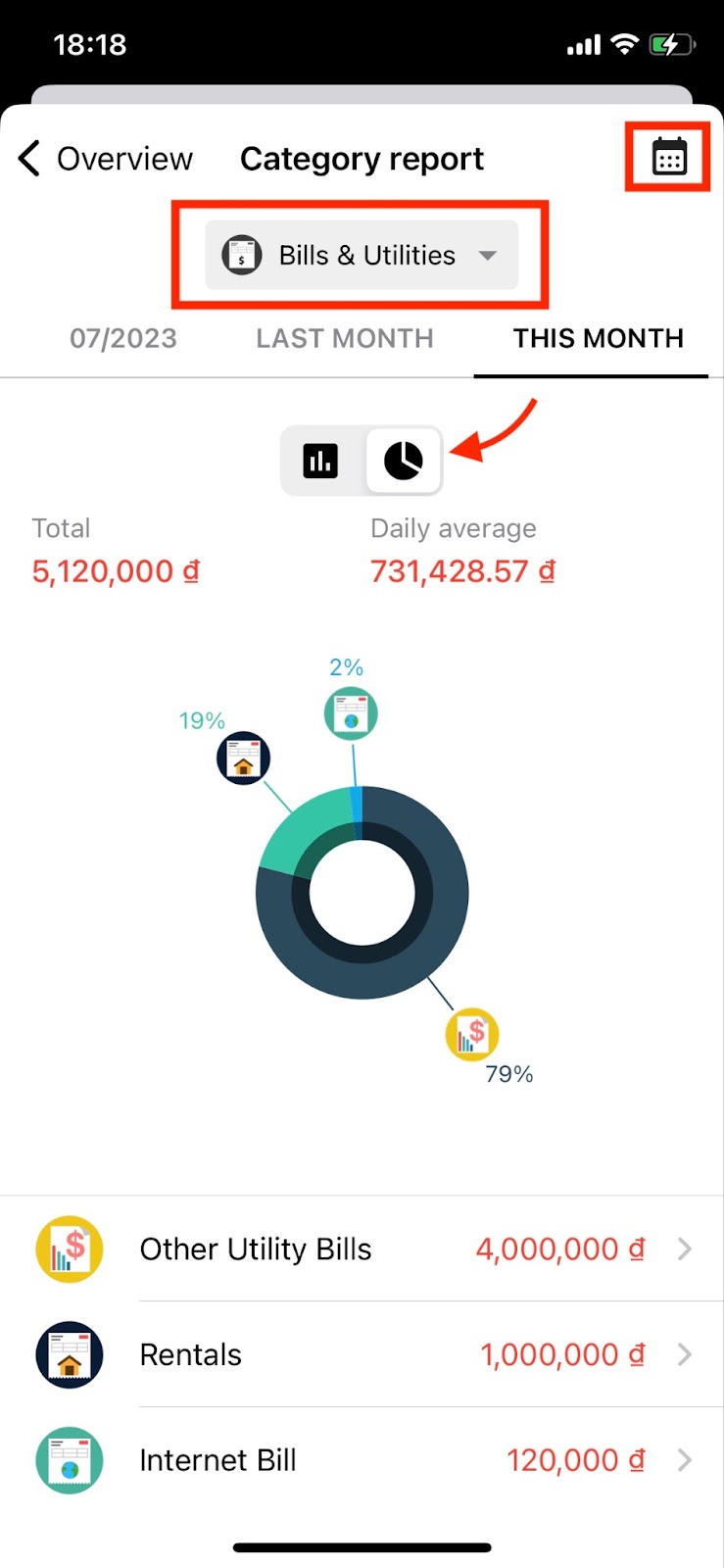
Report parent category (Bills & Utilities) in pie chart format.
You can view reports of subcategories of the parent category you just selected, by selecting that subcategory.
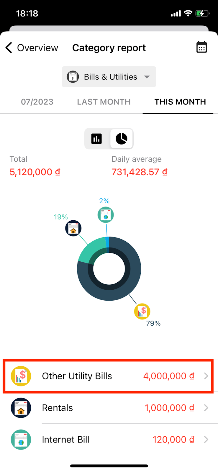
Select a subcategory to view detailed reports.
Once you've selected your preferences, the app will display the subcategory reports accordingly😉.
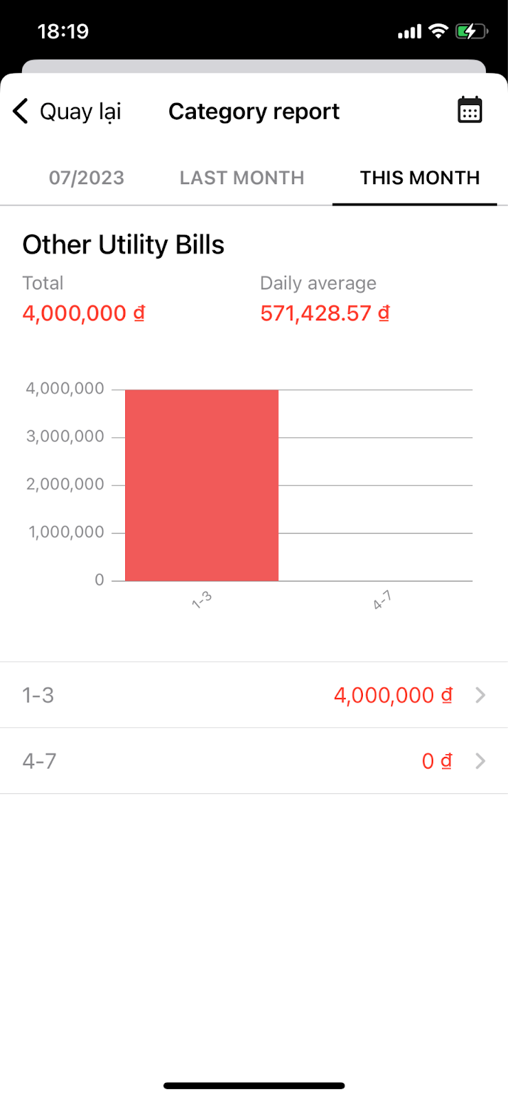
Report of the Other Utility Bills subcategory.
Tada, the entire details of how to view reports on Money Lover app version 8.0 has been revealed above. During usage, if you have any questions, please don't hesitate to contact support at [email protected] 🥳 Thank you for trusting Money Lover to manage your personal finances more effectively🥰